Motivation
Grouping similar samples and separating dissimilar samples are an integral challenge for image recognition such as face recognition and for information retrieval tasks such as image query and retrieval.
The difficulty is compounded when the number of classes are infinite. For instance, there are countless numbers of word phrases people can use to search for an item (depicted by 2D images) or a vastly greater number of photos that do not belong to a single person than his or her photos while the same person could look quite different in his or her photo albums. In the former situation, the number of classes in a classifier cannot be set and trained in advance. In the latter situation, the number of pairs or number of cases would be humongous for any classifier to work with.
Background
To classify anything, a model needs to identify relevant features and compare these features of the present item to those it has seen before. Based on some sort of similar metric, the model puts a label on the present item in relation to others it has seen before. In other words, classification of an image as cat means that the image has shown features more similar to images that are labeled cat than images that are labeled dog during training.
The model relies on feature extract ( such as Convolutional Neural Network that transforms inputs to vectors) to identify relevant features while it relies on a classifier to predict labels.
Because this article is about loss margin that works on classifier, we will leave the discussion of feature extractor out.
Classifiers come in many shapes or forms. Common ones include k-nearest neightbor (kNN), extended nearest neighbnor (ENN), support vector machine, linear classifier, logistic regression, decision tree / random forest, so on and so forth. But what does a classifier really do? To explain its role, I take support vector machine as an example to illustrate what a linear classifier does. (of course, here we assume to have chosen a linear kernel for support vector machine rather than radial basis or polynomial kernels. Otherwise, the decision boundary couldn’t be a simple straight line on a diagram).
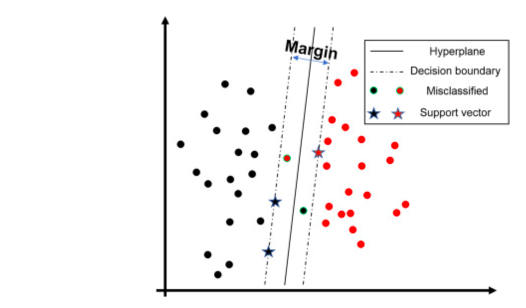
The black and red colors represent two different classes. Here a single dot denotes a single training sample. The blank space depicts a vector space / embedding space into which a feature extractor has transformed the input.
The solid straight line represents a hyperplane. Depending on which side of the hyperplane a sample falls on, the classifier assigns either black or red class labels.
The dotted boundaries enclose the margin, a space that we want to widen without harming the accuracy of the classifier. In support vector machine, the points (drawn as stars) which define the margin or decision boundary are selected from training set and thus are known as support vectors.
When a classifier predicts a sample wrongly, the sample (dots with a green ring) falls on the wrong side of the decision boundary.
With that, we can also re-examine the same situation through the lens of probability.
The probability value is calculated by the distance a sample sits away from the decision boundary. Such distance captures the notation that some samples are more different to others.
With a toy example, Scikit learn has provided a very intuitive plot of the predicted probability assigned to each class for each sample.
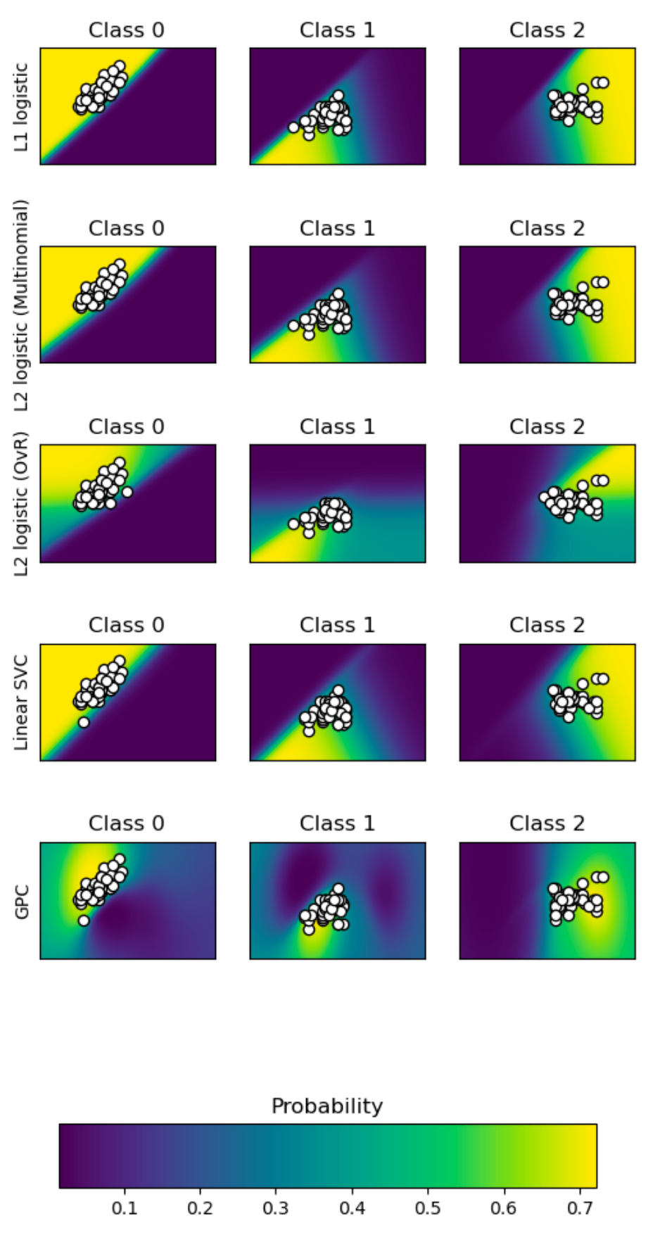
This example examine 5 different classifiers, namely support vector machine, L1 and L2 penalized logistic regression with either a One-Vs-Rest or multinomial setting, and Gaussian process classification. The magnitude of the probability is shown by the color-bar at the bottom. The steepness or the rate of change of the probability at the decision boundary depends on the classifier and constraints. It is interesting to see that L2 logistic (OVR) uses a less precipitous boundary than others of the same categories. Nonetheless, they tend to extrapolate the likelihood even when there is no evidence or samples (see the bright yellow at far corners). The exception is Gaussian process which decays the probability as the distance from samples rises.
In addition, a common consensus is that learning ought to minimize intra-class variance and maximize inter-class variation. In other words, those belonging to one class should be tightly packed. Those coming from different classes should be well-dispersed.
Now we have seen what the decision boundary conceptually looks like and how it works in prediction or in probabilities terms. We are interested in enforcing this margin at the boundary. To do so is no easy task for a convolutional neural network because we typically use cross-entropy loss. The trouble is that cross-entropy loss does not guarantee that the model, upon convergence after optimization uses a decision boundary supported by a wide margin.
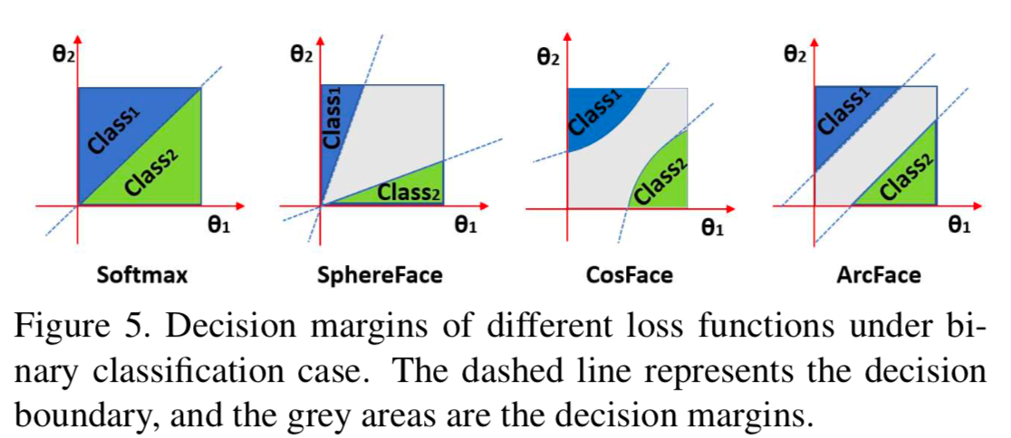
To illustrate this point, we take a look at:
Here is another illustration on the same point.
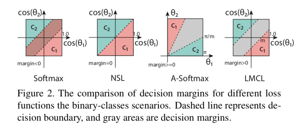
In both Figure 2 and 5, softmax represents cross entropy loss. There is no margin between the two classes (blue and green). It is even possible for the two classes to overlap (negative margin).
SphereFace or angular softmax (A-Softmax) creates a decision boundary that is a function of the angle. As we rotate in this space, the gap between the two classes varies. However, this variability is considered by some to be less than ideal. SphereFace, first published in this paper: SphereFace: Deep Hypersphere Embedding for Face Recognition, aims to spread the two classes on a sphere. The authors use a toy example to show how to control the spread via a parameter m. By tuning the parameter m, the authors encourage the model to clusters the samples in very well-separated blobs.
Anecdotal evidence: I have tried SphereFace several times before, but my experience suggests that it seems harder for some models to converge.
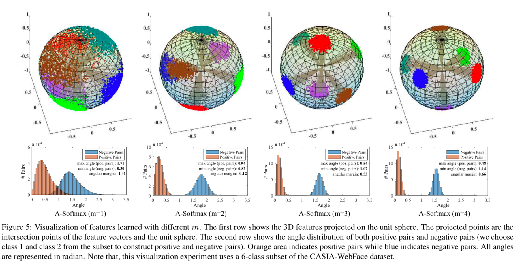
ArcFace, CosFace and Large margin cosine loss (LMCL) are very similar.
Large margin cosine loss (LMCL) represents CosFace. The margin comes in the form of angle, theta, between the two classes. CosFace removes radial variation by normalizing features and weights vectors (L2 norm). The authors have shown that without doing this normalization, the predicted posterior probability would depend on the norm of features and weights and may result in the undesirable overlap in softmax! Here is the author’s own words.
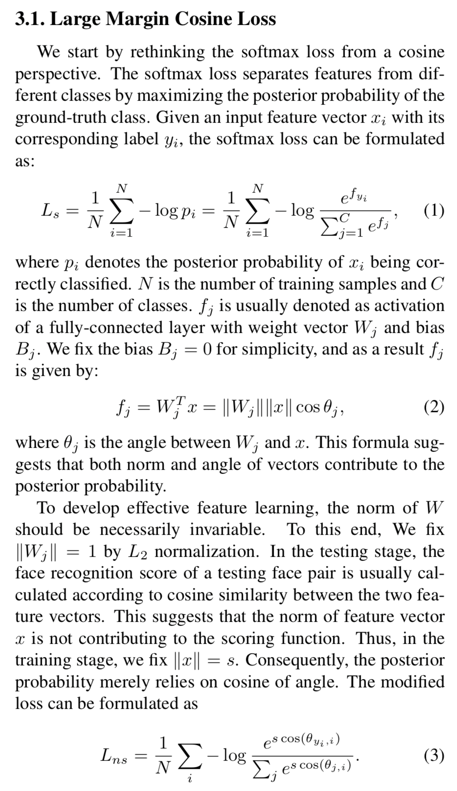
There are several things worth pointing out. By setting the norm of Wj to 1, we take W out of the equation. By setting the norm of x to s, we simply rescale the logits by s to satisfy equation 3.
However, this formulation does not provide the needed margin. To add the margin, m, we simply
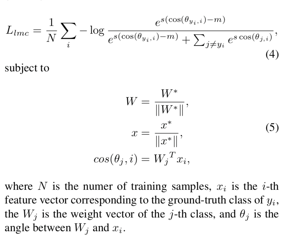
It may seem counter-intuitive to see the authors use minus m when we are trying to “add” margin. The way I understand this is by thinking it through a sequence of logical steps. The problem is minimization; we try to minimize the network loss or negative log likelihood. This act is equivalent to maximizing the posterior probability of the correct classes. To add a margin means to have one class be at least m greater than another class. Therefore, we need to minus m to encourage the model to create a margin that is at least m wide during maximization.
The margin looks like this: 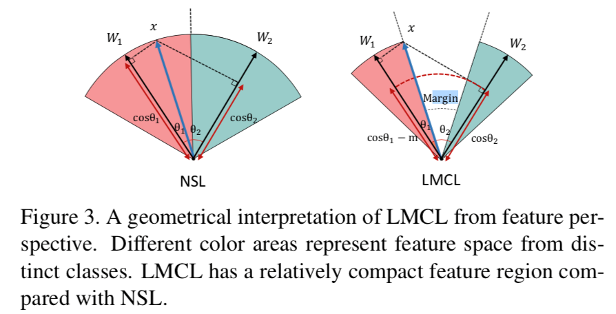
Like CosFace, ArcFace (shown below) also adds a margin m.
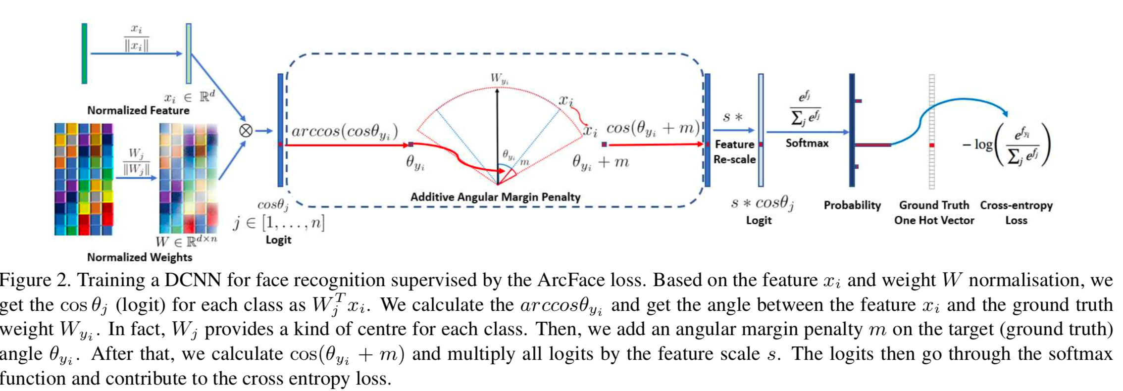
To really compare and contrast SphereFace, CosFace and ArcFace, we need to take a closer look at the maths: 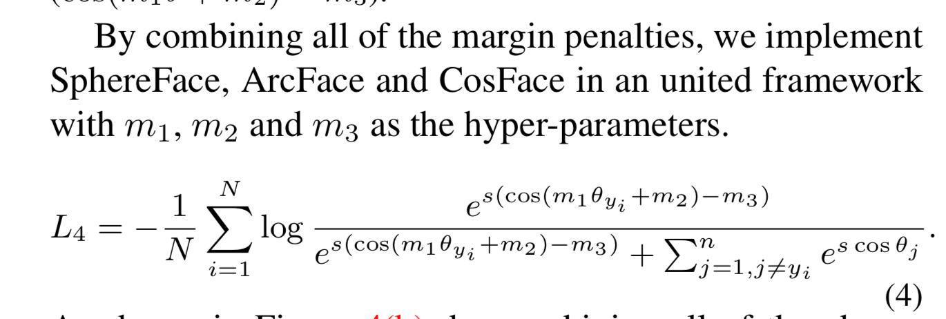
SphereFace uses m1. ArcFace uses m2. CosFace uses m3.
Performances
Based on the results of multiple tests in the paper, I think they all perform equally well. 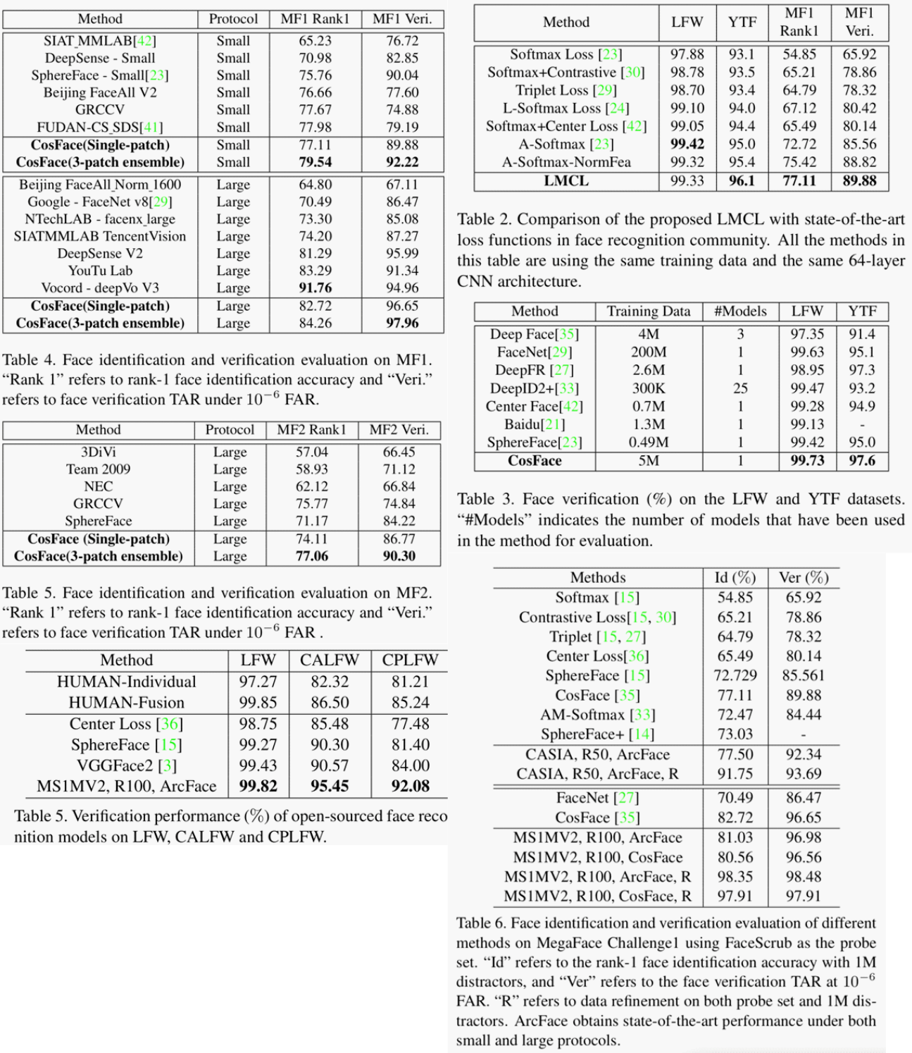
Python Implementation
The official implementation in Pytorch of the above margin losses can be found in the author’s repository .
I would like to take a closer look at their implementation, specifically, arcMargin, addMargin, sphereProduct.
ArcMarginProduct:
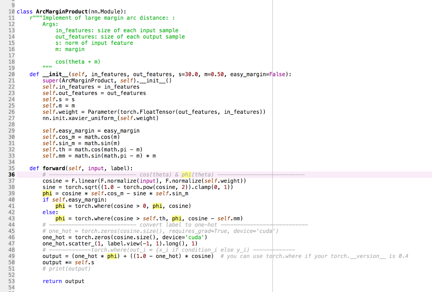 *Line 26: we initialize the weight, W, matrix as the linear classifier *Line 30-33: we convert angle to “geometrical” distance *Line 36: we normalize the embedding and W to a norm value of 1. Thus, we calculate equation 5 in the previous section. *Line 38: we use Pythagoras Theorem to calculate the length. *Line 39-43: this is almost the margin. If the angle is greater than 0 or phi, we update the margin. *Line 49-50: rescale original logit.
AddMarginProduct:
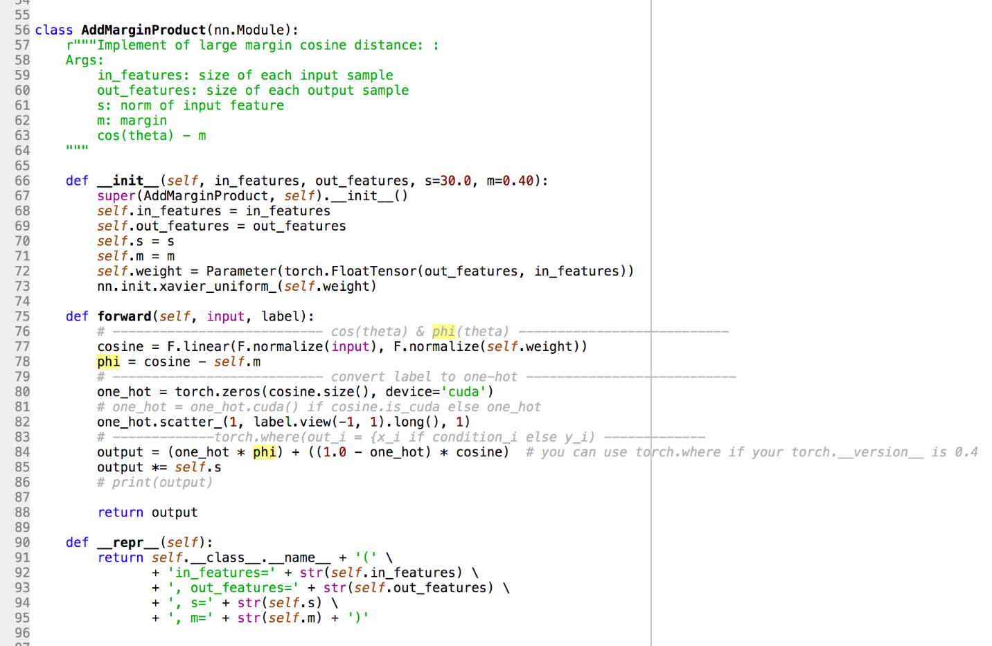 Line 78: unlike ArcMargin, we only care about the angle here.
How to quantify embedding quality?
While I comprehend why the authors go straight to test accuracy as a measure to demonstrate the effectiveness of each loss reformulation, test accuracy may not tell us the whole story even though the quality of the embedding is just a means to an end.
Anyway, I think we could also try to use silhouette score to quantify the goodness of the shape of the groups of samples of the classes in the embedding space.
Here is a quote from scikit learn page on silhouette score
Compute the mean Silhouette Coefficient of all samples. The Silhouette Coefficient is calculated using the mean intra-cluster distance (a) and the mean nearest-cluster distance (b) for each sample. The Silhouette Coefficient for a sample is (b - a) / max(a, b). To clarify, b is the distance between a sample and the nearest cluster that the sample is not a part of. Note that Silhouette Coefficient is only defined if number of labels is 2 <= n_labels <= n_samples - 1. This function returns the mean Silhouette Coefficient over all samples. To obtain the values for each sample, use silhouette_samples. The best value is 1 and the worst value is -1. Values near 0 indicate overlapping clusters. Negative values generally indicate that a sample has been assigned to the wrong cluster, as a different cluster is more similar.
From my experience, the real-world is not as clean as the textbook, higher silhouette score may not necessarily lead to better accuracy.
