I am going to explore a way to quantify price movement in price action time series stock data and then evaluate the correlation between movement and the monthly log return of some stocks.
I have come across a way to measure noise in price action time series data from this book- A Guide to Creating A Successful Algorithmic Trading Strategy by Perry Kaufman.
The tool the author introduced is called efficiency ratio. Efficiency ratio is calculated as the net change of the price over a fixed period divided by the sum of the absolute daily price change. In other words, how many incremental price changes are needed to arrive at the final price from the initial price and the path the initial price travels to reach the final price. In theory, the ratio is mathematically bound between 0 and 1. The higher the efficiency ratio, the price movement would be more like a straight line.
Let’s look at some examples. To see how efficiency ratio works in practice, I’ve selected some 500 stocks from the US market and the Hong Kong market because their historical records are available for free at yahoo.com. My stock criteria are:
- They have no missing price action data.
- Their end-of-the-day close price is available.
- They have a long trading history- more than 4000 entries of price actions.
- Their average daily trading volume is about 5200000.
- The period in which we do all the calculations must have at least one trade. That is, the trading volume is greater than 0.
- Prices are positive.
Based on the author’s description, I calculate the efficiency ratio like this:
def cal_efficiencyRatio(x2):

    total_movement = np.sum(np.abs(np.diff(x2, axis=0)), axis=0)
    net_change = np.abs(x2[-1,:] - x2[0,:])
    return net_change / total_movement, net_change, total_movement
Based on the general definition of log return, I calculate the log return like this:
lookback_period, forward_period = full[0:TRADINGDAYS_YEAR], full[TRADINGDAYS_YEAR:]

log_return = np.log(forward_period[-1,:]) - np.log(forward_period[0,:])
For every stock, I examine a continuous window of 13-month of price action time series. The efficiency ratio is calculated over the past 12-month. The log return is calculated over the last or 13th month only. The window slides across by 1 trading day to calculate the next efficiency ratio and log return until the end of the time series is reached. To see the effect of the price actions on efficiency ratio, I rank the efficiency ratios under either positive or negative log return.
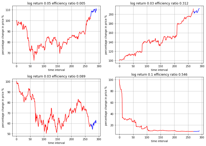
The four figures below show the different efficiency ratio, ranging from low to high. 
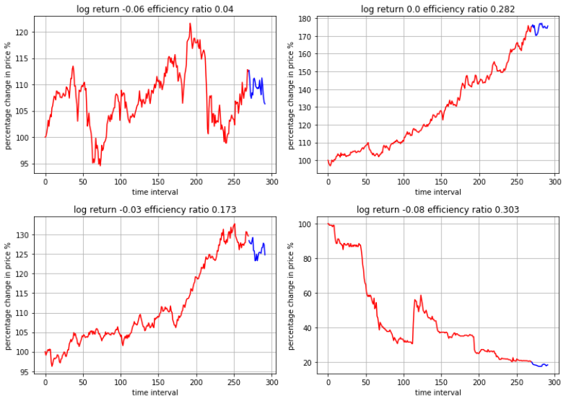
The red line represents the price action over the past 12 months, in which the efficiency ratio is calculated. The blue line represents the price action over the next month / 13th month, in which the log return of the stock is calculated.
To make comparison easier, I put the y-axis as the percentage change in price relative to the initial price. X-axis shows the time interval since trading day 0 when the period begins until trading day 300.
From these four figures, we can see that as the efficiency ratio rises, the price action patterns become more linear and more like a step-function. The more oscillations, the lower the efficiency. In fact, some very high efficiency ratio comes from a sudden rise or drop in price, perhaps a possible consequence of cooperate actions or announcements.
While the above four show positive log return over the next month, I take a closer look at another set of four which show negative or zero log return.

Another interesting observation is that even though the efficiency ratios are similar, the actual path travelled by the price can be very different. Next, what is the relationship between the efficiency ratio and monthly log return of these stocks?

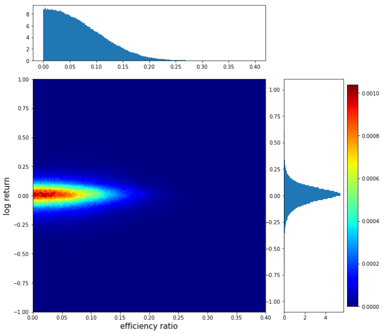
The figure shows the distribution of efficiency ratio, log return and the cooccurrence of the two. The square figure is a heatmap of the log return vs efficiency ratio. The histograms on the top and on the right show the distributions of efficiency ratio and log return respectively.
Most of the values of the efficiency ratio taper off after 0.2 and are very heavily left skewed. The log return appears bell-like with most values tapering off after +- 0.25. I’ve tested its normality using the Shapiro-Wilk test and normality test as follows:
Despite its appearance, there is enough evidence to suggest the log return distribution is not normal.
The heatmap represents the probability of cooccurrence of the efficiency ratio and log return across their ranges. Red means higher probability of cooccurrence; blue means lower probability. The pattern reveals an ellipse, lying horizontally and radiating outward. This orientation and shape suggest that there is no or little correlation between efficiency ratio over the past 12 months and log return over the next month.
Indeed, I’ve calculated their Pearson product-moment correlation coefficient to be about 0.001.
Python script
import pandas as pd
import numpy as np
import os, copy
import matplotlib.pyplot as plt
import math
from collections import defaultdict
from pathlib import Path

import matplotlib.pyplot as plt
import matplotlib as mpl


def plot_hist_density(x,y, x_min, x_max, y_min, y_max, xbins, ybins):

    x = np.array(x)
    y = np.array(y)

    # Plot parameters - global
    left, width = 0.1, 0.63
    bottom, height = 0.1, 0.63
    bottom_h = left_h = left + width + 0.05 # spacing
    rect_2dhist = [left, bottom, width, height]
    rect_histx = [left, bottom_h, width, 0.15]
    rect_histy = [left_h, bottom, 0.2, height]

    # Plot location and size
    fig = plt.figure(figsize=(10, 10))
    ax2dhist = plt.axes(rect_2dhist)
    axHistx = plt.axes(rect_histx)
    axHisty = plt.axes(rect_histy)


#    x = np.random.rand(1000)
#    y = np.random.rand(1000)
#
#    xbins = 10
#    ybins = 10
#
    xrange = np.linspace(x_min,x_max,xbins)
    yrange = np.linspace(y_min,y_max, ybins)
#    xrange = np.linspace(0,0.2,xbins)
#    yrange = np.linspace(-0.5,0.5, ybins)

    H, xedges, yedges = np.histogram2d(y, x, bins=(yrange,xrange))

    #normalize
    H = H / np.sum(H)

    # Use the bins to find the extent of our plot
#    extent = [yedges[0], yedges[-1], xedges[0], xedges[-1]]

    # levels = (5, 4, 3) # Needed for contours only...

    X,Y=np.meshgrid(xrange,yrange) # Create a mess over our range of bins

    # Fix colors -- white for values of 1.0.
    cmap = copy.copy(mpl.cm.jet)
    cmap.set_bad('w', 1.)  # w is color, for values of 1.0

    cax = (ax2dhist.pcolormesh(X,Y, H, cmap=cmap))
    # Setup the color bar
    cbar = fig.colorbar(cax)
    #cbar.ax.set_yticklabels(['1', '2', '4', '6', '8'], size=24)
    ax2dhist.set_xlabel('efficiency ratio', size=15)
    ax2dhist.set_ylabel('log return', size=15)

    ##########################################################
    # Create the axes histograms
    ##########################################################
    # Note that even with log=True, the array N is NOT log of the weighted counts
    # Eventually we want to normalize these value (in N) by binwidth and overall
    # simulation volume... but I don't know how to do that.
    N, bins, patches = axHistx.hist(x, bins=xrange, density=True)
    N, bins, patches = axHisty.hist(y, bins=yrange,  density=True, orientation='horizontal')


#
def cal_efficiencyRatio(x2):

    total_movement = np.sum(np.abs(np.diff(x2, axis=0)), axis=0)
    net_change = np.abs(x2[-1,:] - x2[0,:])
    return net_change / total_movement, net_change, total_movement


##########################
def array_generator(x, interval):

    L = len(x)
    for start in range(0, L-interval+1):
#        print (start, start+interval)
        yield x[start:start+interval][:,np.newaxis]


cwd = Path.cwd()

TRADINGDAYS_YEAR = 270
TRADINGDAYS_MONTH =int( math.floor(TRADINGDAYS_YEAR / 12))
LOOKBACK_ONEMONTH = TRADINGDAYS_YEAR + TRADINGDAYS_MONTH


filePath = (cwd / '../blogs/price_action_data_stats.csv' ).resolve()
df = pd.read_csv(filePath)

ratio_table = defaultdict(list)

stock_list = list(df['path'].apply(os.path.basename)[-500:])

print ('average daily trading volume {}'.format(np.mean(df['average_trading_volume'].iloc[-500:])))

for i in range(1,500):
    print (i)
    path = df['path'].iloc[-i]


    pa = pd.read_csv(path)
    x = pa['Close'].values
    vol = pa['Volume'].values

    for t, (full, full_vol) in enumerate(zip(array_generator(x, LOOKBACK_ONEMONTH),
                                 array_generator(vol, LOOKBACK_ONEMONTH))):
        lookback_period, forward_period = full[0:TRADINGDAYS_YEAR], full[TRADINGDAYS_YEAR:]

        log_return = np.log(forward_period[-1,:]) - np.log(forward_period[0,:])

        ratio, net_change, total_movement = cal_efficiencyRatio(lookback_period)

        if np.isnan(ratio):
            print ('i {}, t{}, ratio {}, net change {}, total movement {}'.format(i, t,
                   ratio, net_change, total_movement))
        else:

            ratio_table['path'].append(i)
            ratio_table['time'].append(t)
            ratio_table['log_return'].append(log_return[0])
            ratio_table['efficiency_ratio'].append(ratio[0])
            ratio_table['volume'].append(np.min(full_vol))


ratio_table_df = pd.DataFrame.from_dict(ratio_table)

liquid_ratio = ratio_table_df[ratio_table_df['volume'] > 0]


plot_hist_density(liquid_ratio['efficiency_ratio'],
                  liquid_ratio['log_return'],
                  0,
                  0.4,
                  -1,
                  1,
                  200,
                  200)


###############################################
from scipy import stats
print (stats.shapiro(liquid_ratio['log_return']))

k2, p = stats.normaltest(liquid_ratio['log_return'])

alpha = 1e-3

if p < alpha:
    print ('the null hypothesis can be rejected')
else:
    print ('the null hypothesis cannot be rejected')


print (np.corrcoef(liquid_ratio['efficiency_ratio'],
                  liquid_ratio['log_return']))
